Data Collection
Data collection is a pipeline including the identification of the data, the collection, and the preprocessing into a state that is usable for analysis. In this project, four main types of data were collected, including COVID cases, seismic noise mobility, transit statistics, and mobility index.
COVID cases
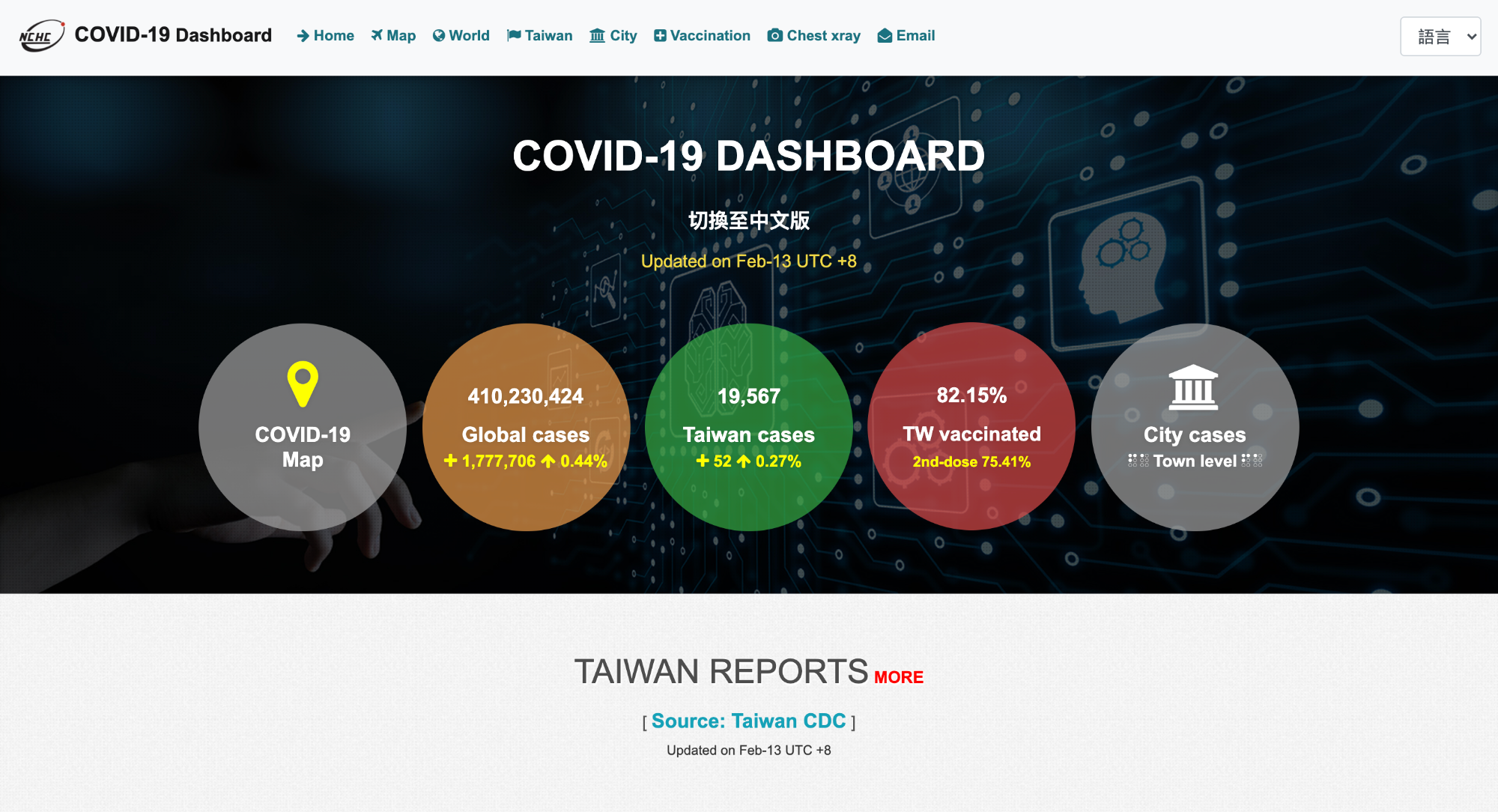
The COVID cases data were collected from the Our World in Data's COVID-19 Dataset and NCHC COVID-19 Dashboard in the format of CSV (comma-separated values) files. Specifically, owid-covid-data.csv in the Our World in Data database was used as this file contains the COVID-19 cases per country data over the time frame from Jan 22, 2020 to the present date for the entirety of Taiwan and each city's COVID cases were extracted from the City/Town COVID-19 Daily Cases page in the NHCH dashboard.
Seismic Noise Mobility
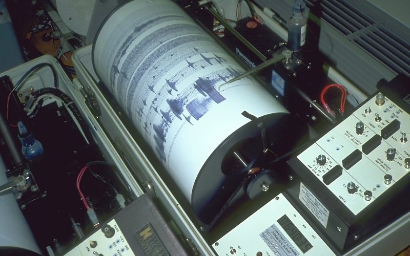
Seismic noise mobility uses raw seismic data from seismometers. These files are collected from the GDMS database operated by the Central Weather Bureau of Taiwan in the format of miniSEED files, a standard format in seismology that stores relevant information on seismic waves. This website contains an open database consisted of three seismographic networks in Taiwan. Out of the three different networks, the Central Weather Bureau Seismographic Network (CWBSN) was used as it has the most complete instruments out of the three networls.
Transit Statistics
Transit statistics include Taiwan High Speed Rail (HSR), Taiwan Railway, Taipei Metro, Kaohsiung Metro, and Taichung Metro. Each dataset is downloaded or copied directly from their websites or from the National Open Data website. Due to the difference in temporal resolution among the datasets, monthly records were used for Taiwan HSR, Taiwan Railway, Kaohsiung Metro, while daily records were used for Taipei Metro and Taichung Metro.
Mobility index
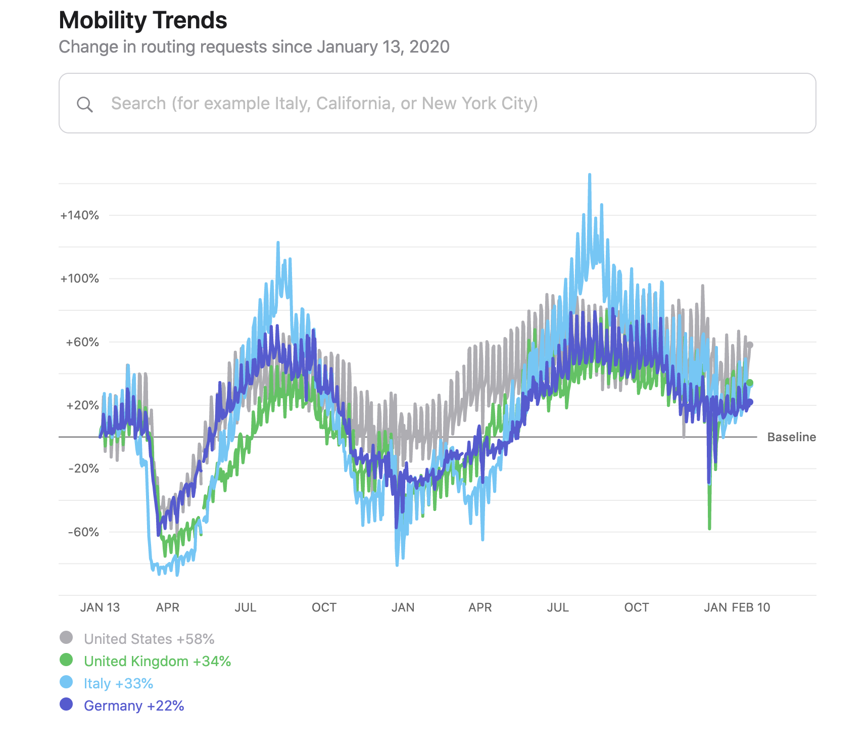
Mobility index refers to mobility trends report by Apple and Google. These two technological companies used map apps data to create a global mobility index. Google's COVID-19 Community Mobility Reports uses anonymized "location history" feature on Google Map to infer public mobility in terms of the walking, driving, and transiting. However, the spatial resolution for Taiwan is only to the degree of the entire country. Therefore, only one story map uses this data. On the other hand, Apple's Mobility Trends Reports uses Apple Map's "direction searches" to determine the movement of the public under lockdowns. The spatial resolution is at the city level, which is useful for more granular analyses with other records.
Data Analysis
The data analysis of the collected statistics mainly involves time series analysis where the each type of mobility data is plotted with other types of data or simply own its own with important time stamps related to the COVID-19 situation (e.g., lockdown data). Nevertheless, the seismic noise mobility involves a more complicated analysis out of the four types of data. Therefore, this section will mainly be demonstrating the inference of mobility changes using seismic noise records.
What is Seismic Noise?
Before showing the inference process, we first need to clarify on what is seismic noise. Seismic noise, also often known as ambient noise, is the background noise recored on the seismometer when no earthquakes are occurring. Imagine seismometers as voice recorders of the ground. Similar to voice recordings, we obtain background noise whenever we are recording some conversation. In this analogy, the earthquake event are like the voices in the recordings as earthquake signals are often multiple magnitude stronger than background noise. For a long time, seismologist thought of these background noise as useless. However, in the past decade, seismologist found that there are various techniques to convert these noises into meaningful information.
In this project, we do not got deep into inference of seismic noise -- we rather view seismic noise similar to any type of waves. Every type of wave has an associated frequency attach to it. Depending on the source, the frequency of the waves will be different, such as the pitch difference between a woman and a man. Since men has a lower voice, the range of frequencies men can articulate is in the lower compared to that of women. This is the same with background noise -- every single input has its own frequency under the hood.
How Can We Infer Mobility from Seismic Noise?
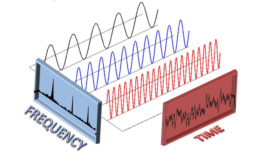
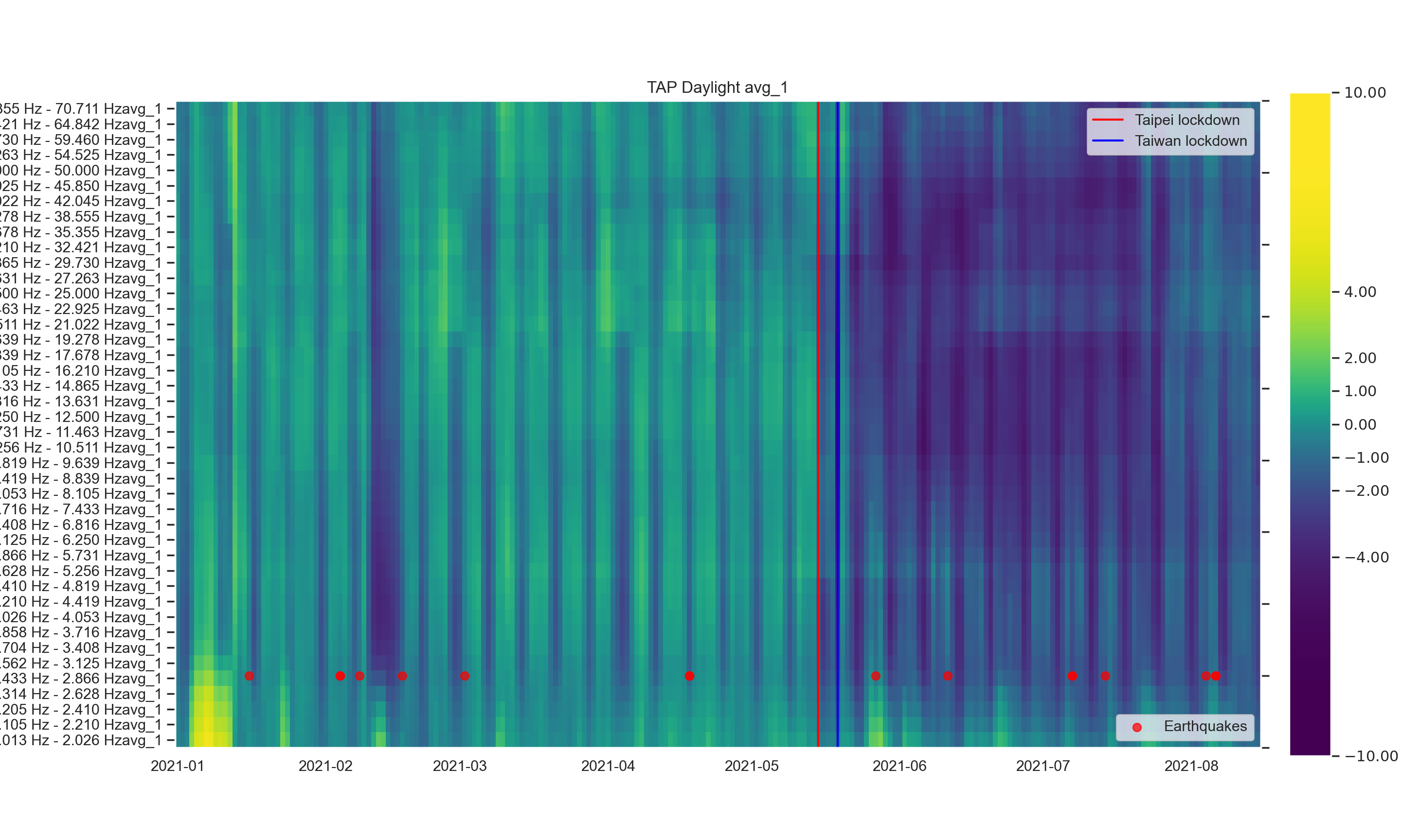
Here comes the problem: background noise includes multiple sources that all mixed together. Just imagine how many different people's voices would be recorded if you were recording in a cafe! It is practically impossible to extract what Joe is saying from what Jack is saying -- especially when their talking 2 tables away from you. Hence, seismologists use a mathematical tool called Fourier Transforms to find the magnitude of the different frequency bands. Going back to our cafe example, this is similar to saying that you want to know the volume of all men around you since they have lower voice registers compared to the volume of all women. The outcome is not how loud Joe or Jack are speaking but rather the combination of them. For our purposes, by finding the change in magnitude of frequency of human activities (e.g., people transiting, driving, or even walking), we can then infer the change in mobility using seismic noise origins.
How Can We Verify this Inference?
Now that we find the magnitude of each frequency band, how do we know which is related to human activities? In the past, seismologists have used various proxy measures to find the frequency of general human activities. For example, one study measures finds that certain frequency bands are stronger around transit hubs, such as underneath metro lines or railway stations. However, COVID-19 pandemic gave seismologists the perfect opportunity to verify the frequencies related to human activities since lockdown measures around the world offer clear seismic records under the scenario where human activity level decreases. In addition, other sources of evidence, such as COVID mobility indexes from Apple and Google, enables the verification of the inference quantitatively. Therefore, although this is still an on-going research, there is an consensus in the seismology community that the reduction in seismic noise magnitude under certain frequency ranges correspond to the decrease in mobility among the human population.
Data Visualization
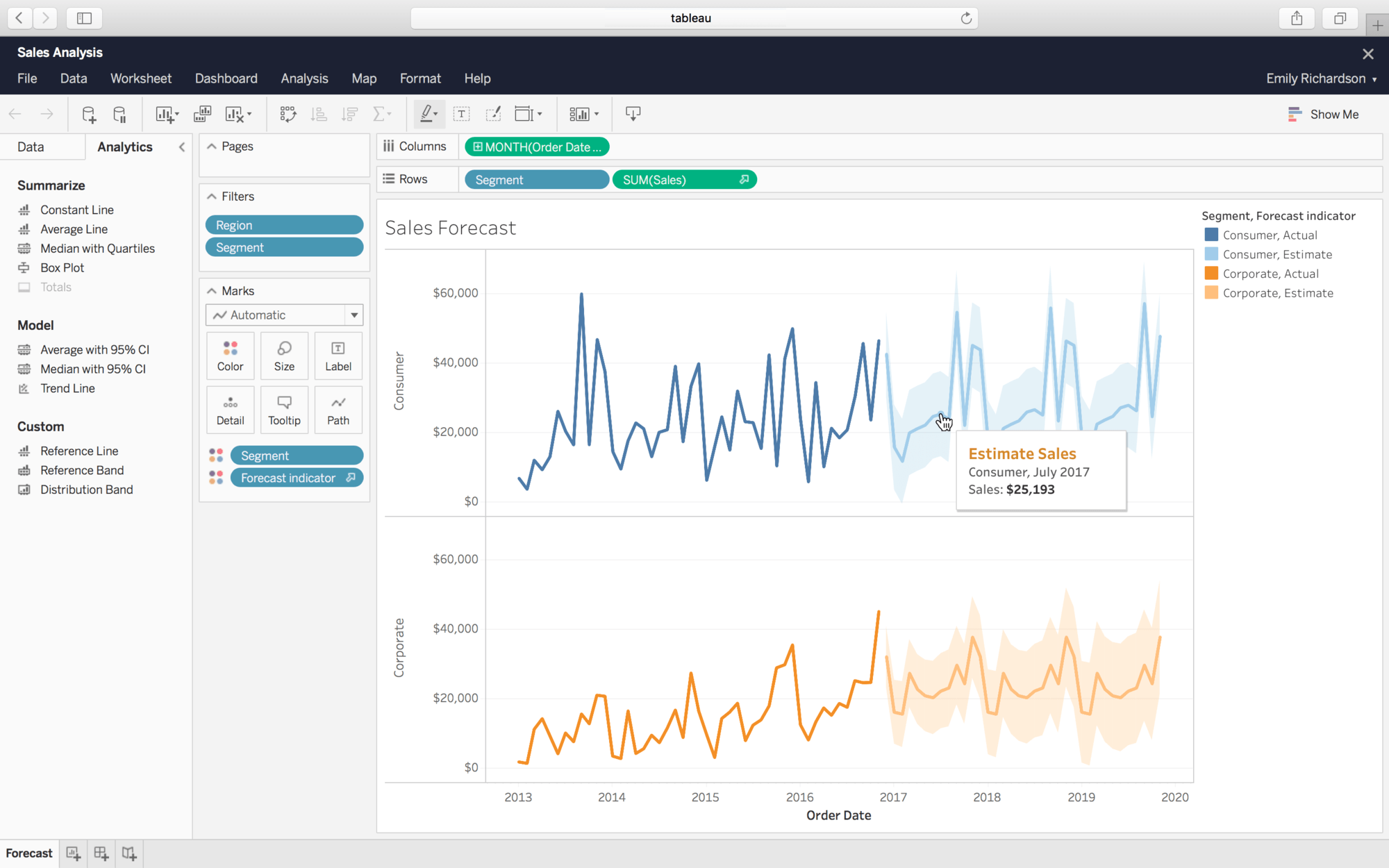
After obtaining the seismic mobility records and other types of data, the visualization of the data was needed to present and interpret the data for the audience. In this project, the main tools I used was Tableau.
Visualization Styles

Tableau is a data visualization software that smartly configures the data for effective communication. This project uses Tableau in two ways according to the style of visualization. The first style is time series line plot. As mentioned in the data analysis section above, most of the data are analyzed using time series line plots since it is useful for comparing among data and is critical when pinpointing the specific changes as lockdown occurs. This was the case for the transit datasets and COVID cases data. The second style is a time series map visualization which includes geographical locations of stations or cities in order to depict the changes spatially along with time. This was used for the seismic noise index as it can show the difference chronologically and spatial across the island. In addition, Mapbox API was used to style the maps uniquely to provide responsiveness and better appearance.
Data Transformation
To apply Tableau's functions, one key step is to transform the datasets into tables (similar to SQL to be technical) with each column containing one aspect of the data. For example, for each station, there would be station name column, a date column, and a mobility index column. In order to input this data in Tableau, we would need to repeat the station name along with the changing date and mobility index so that at each timestamp, we would have the name of the station and the associated mobility index. For the map visualization, a connection between the geographical description of each station and the mobility index data needs to be established.